Data Analysis with R
Welcome to the exciting world of data analysis!
This section will help you move beyond basic R programming and show you how to turn health and clinical data into meaningful insights that can inform patient care, research, and medical education.
You’ll learn to use powerful R packages such as:
dplyr— for cleaning and analyzing patient datasetsggplot2— for creating clear, evidence-based visualizationsstats(built-in) — for performing statistical tests and clinical comparisons
By the end of this section, you’ll be able to:
- Load and explore datasets from sources such as hospital records or surveys
- Clean and transform messy data (e.g., missing values in lab tests)
- Visualize patterns such as blood pressure trends or lab result distributions
- Perform basic statistical analyses to support clinical and research conclusions
Introduction to Data Analysis Packages
Before diving into analysis, let’s explore the core R packages that make data analysis possible — and how they apply to the medical field.
library(dplyr)     # Data manipulation and analysis
library(tidyr)     # Data reshaping
library(ggplot2)   # Data visualization
library(readr)     # Fast CSV reading
There will be times when there are warning messages such as:
Warning message:
package ‘ggplot2’ was built under R version 4.5.3
and it’s completely fine. The warning message just means that the package in question was created in an R version that is lower than your current version.
These packages are all part of the tidyverse — a coherent collection of R packages designed for data science. You can install them all at once:
install.packages("tidyverse")
library(tidyverse)
What it does: Handles tabular data (like Excel sheets or patient records) using intuitive, readable verbs.
library(dplyr)

# Example patient dataset
data <- data.frame(
  Name           = c("Ana", "Luis", "Maria"),
  Age            = c(34, 45, 29),
  Blood_Pressure = c(120, 135, 110)
)

# View average blood pressure
mean(data$Blood_Pressure)                               # 121.6667
💡Use case: Compute the average blood pressure of patients in a study.
What it does: Performs fast mathematical operations on vectors and matrices — no extra package needed.
# Systolic blood pressure readings
bp <- c(120, 130, 110, 125, 140)

# Compute mean and standard deviation
cat("Mean BP:", mean(bp), "\n")           # Mean BP: 125
cat("SD BP:",   sd(bp),   "\n")           # SD BP: 11.18034
💡Use case: Analyze variability in blood pressure readings from a clinical trial.
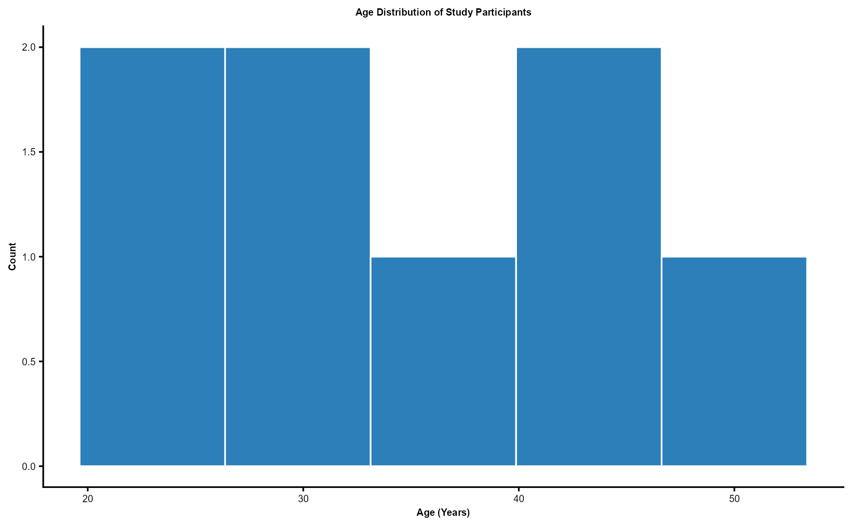
What it does: Creates elegant, layered plots and charts.
library(ggplot2)

ages <- c(23, 45, 34, 50, 29, 45, 29, 23)
df_ages <- data.frame(Age = ages)

ggplot(df_ages, aes(x = Age)) +
  geom_histogram(
    bins  = 5,
    fill  = "#2C7FB8",
    color = "white"
  ) +
  labs(
    title = "Age Distribution of Study Participants",
    x     = "Age (Years)",
    y     = "Count"
  ) +
  theme_classic(base_size = 35) +
  theme(
    plot.title = element_text(
      face     = "bold",
      size     = 20,
      hjust    = 0.5
    ),
    axis.title = element_text(
      face     = "bold",
      size     = 20
    ),
    axis.text = element_text(size = 20)
  )
💡 Use case: Visualize the age distribution of your study participants.
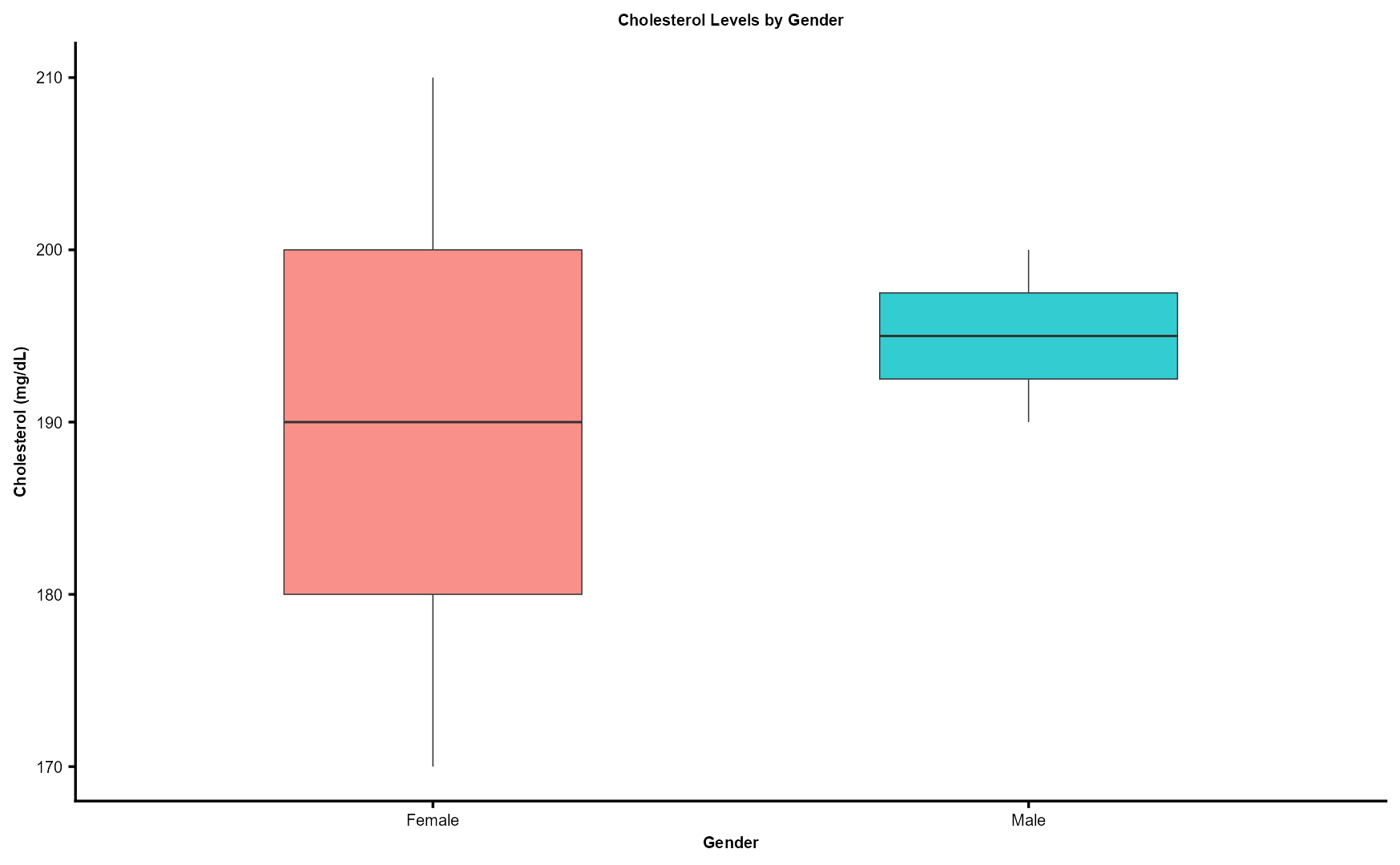
What it does: Makes elegant statistical plots with very little code.
library(ggplot2)

df <- data.frame(
  Gender      = c("Male", "Female", "Female", "Male"),
  Cholesterol = c(190, 170, 210, 200)
)

ggplot(df, aes(x = Gender, y = Cholesterol, fill = Gender)) +
  geom_boxplot(
    width         = 0.5,
    alpha         = 0.8,
    linewidth     = 0.7,
    outlier.shape = NA
  ) +
  labs(
    title = "Cholesterol Levels by Gender",
    x     = "Gender",
    y     = "Cholesterol (mg/dL)"
  ) +
  theme_classic(base_size = 35) +
  theme(
    plot.title = element_text(
      face     = "bold",
      size     = 20,
      hjust    = 0.5
    ),
    axis.title = element_text(
      face     = "bold",
      size     = 20
    ),
    axis.text = element_text(
      size    = 20,
      color   = "black"
    ),
    legend.position = "none"
  )
💡 Use case: Compare cholesterol levels across genders or groups.
What it does: Performs statistical tests, correlations, and probability functions. It is built into R — no installation needed.
# Two groups of fasting blood sugar values
group_A <- c(95, 100, 110, 120, 130)
group_B <- c(90,  92,  88,  85,  93)

result  <- t.test(group_A, group_B)
cat("t-statistic:", result$statistic, "\n")     # t-statistic: 3.261195
cat("p-value:",     result$p.value,   "\n")     # p-value: 0.02700263
💡 Use case: Compare two treatment groups’ fasting blood sugar levels.
In short
R offers powerful tools for handling, visualizing, and analyzing data.
dplyris your best friend for managing patient records or clinical datasets.- Base R enables fast, vectorized calculations on medical measurements.
ggplot2helps you visualize trends clearly for research or presentations.stats(built-in) provides statistical tools to support evidence-based conclusions.
Together, these packages form the foundation of data analytics in R.