Data Visualization
Visualizations help reveal patterns in clinical data — such as disease prevalence, lab result distributions, and relationships between vital signs — and effectively communicate findings to support medical decisions or publications.
Load package and set default theme
library(ggplot2)
theme_pub <- theme_classic(base_size = 35) +
  theme(
    plot.title = element_text(
      size = 20,
      face = "bold",
      hjust = 0.5
    ),
    axis.title = element_text(
      size = 20,
      face = "bold"
    ),
    axis.text = element_text(
      size = 20,
      color = "black"
    ),
    legend.title = element_text(
      size = 20,
      face = "bold"
    ),
    legend.text = element_text(
      size = 20
    ),
    plot.margin = margin(10, 10, 10, 10)
  )
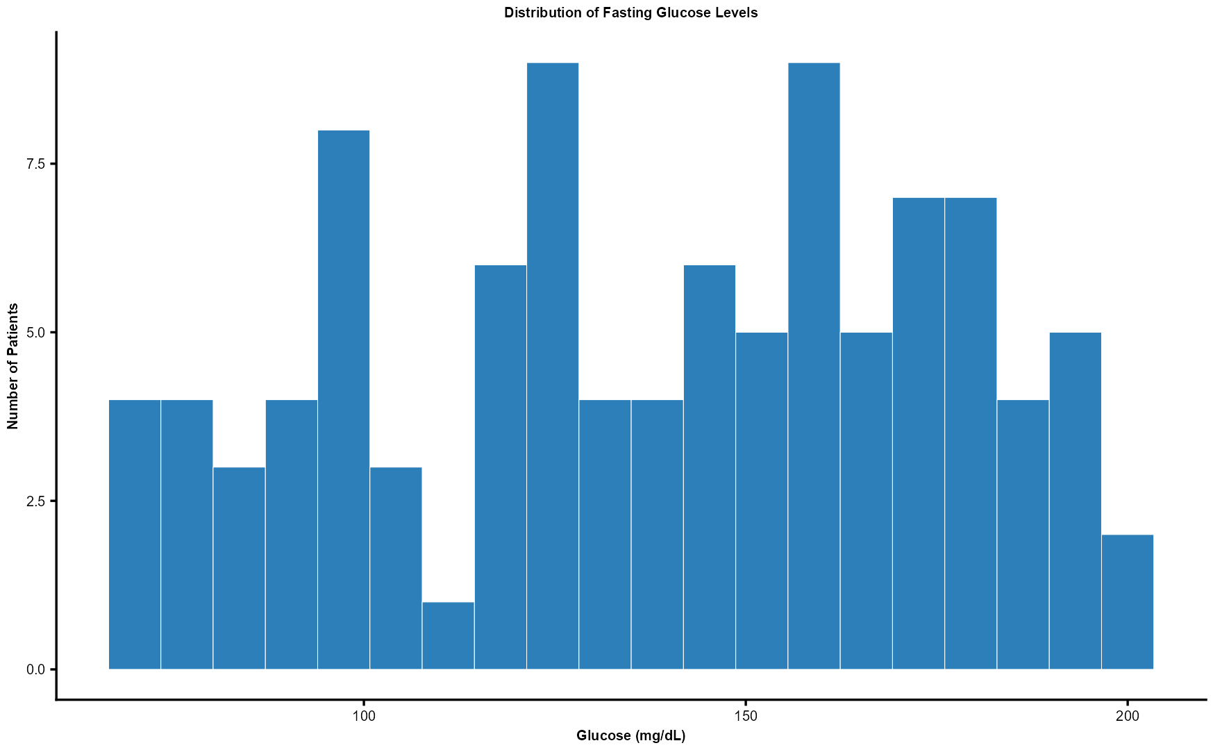
💡 Use case: Quickly visualize how many patients fall into normal, prediabetic, or diabetic glucose ranges.
ggplot(df, aes(x = Glucose)) +
  geom_histogram(
    bins = 20,
    fill = "#2C7FB8",
    color = "white",
    linewidth = 0.5
  ) +
  labs(
    title = "Distribution of Fasting Glucose Levels",
    x = "Glucose (mg/dL)",
    y = "Number of Patients"
  ) +
  theme_pub
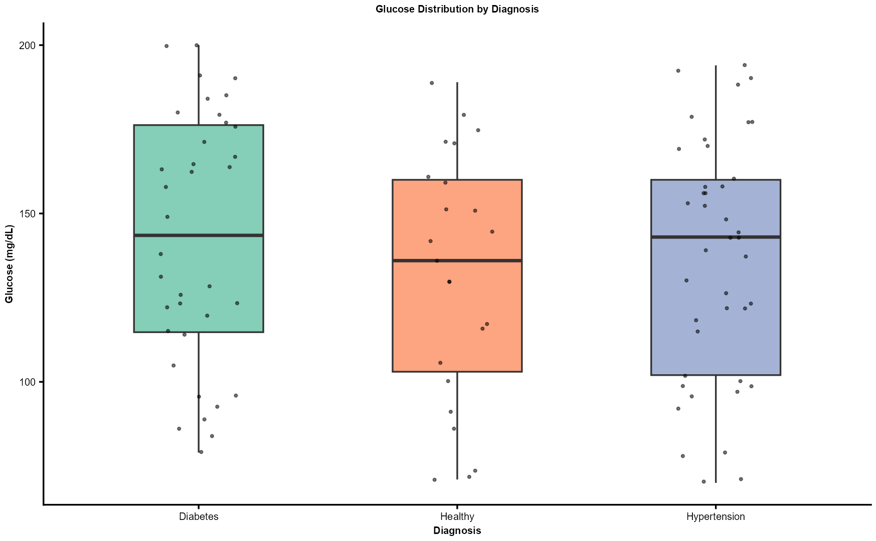
💡 Use case: Compare glucose variability across different conditions (e.g., Diabetes, Hypertension, Normal).
ggplot(df, aes(x = Diagnosis, y = Glucose, fill = Diagnosis)) +
  geom_boxplot(
    width = 0.5,
    alpha = 0.8,
    outlier.shape = NA
  ) +
  geom_jitter(
    width = 0.15,
    alpha = 0.5,
    size = 1.8
  ) +
  scale_fill_brewer(
    palette = "Set2",
    guide = "none"
  ) +
  labs(
    title = "Glucose Distribution by Diagnosis",
    x = "Diagnosis",
    y = "Glucose (mg/dL)"
  ) +
  theme_pub +
  theme(
    axis.text.x = element_text(
      angle = 0,
      hjust = 0.5
    )
  )
Here, we’ll produce the following plots:
- Correlation heatmap
- Scatter plot
- Density plot
- Violin plot
- Count/bar plot
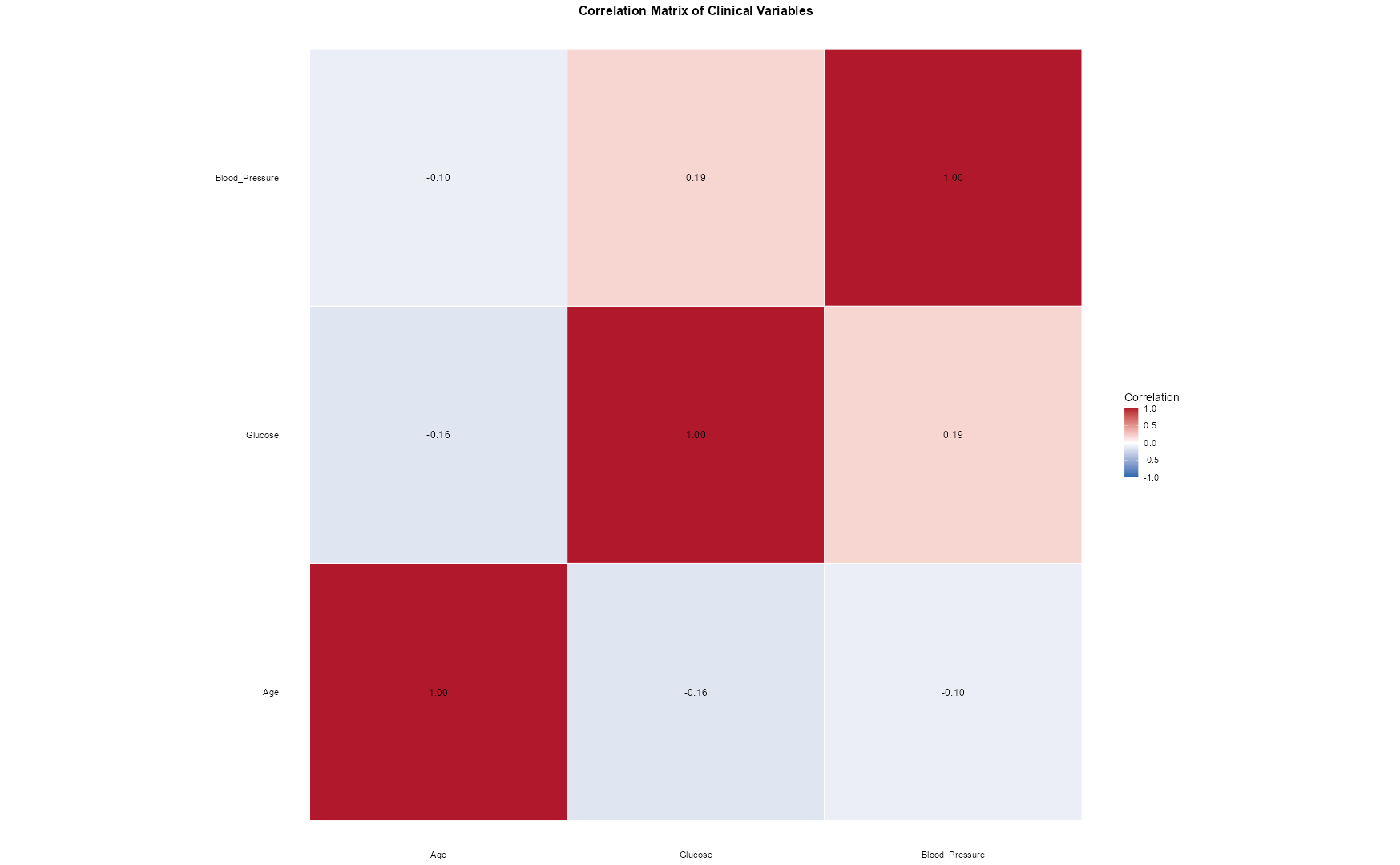
💡 Use case: Identify correlations (e.g., between Age and Blood Pressure).
library(reshape2)   # or use tidyr::pivot_longer

corr_matrix <- cor(df |> select(Age, Glucose, Blood_Pressure), use = "complete.obs")
corr_melt   <- melt(corr_matrix)

ggplot(corr_melt,
       aes(
         x = Var1,
         y = Var2,
         fill = value
       )) +
  geom_tile(
    color = "white",
    linewidth = 0.5
  ) +
  geom_text(
    aes(label = sprintf("%.2f", value)),
    size = 4.5
  ) +
  scale_fill_gradient2(
    low = "#2166AC",
    mid = "white",
    high = "#B2182B",
    midpoint = 0,
    limits = c(-1, 1),
    name = "Correlation"
  ) +
  coord_fixed() +
  labs(
    title = "Correlation Matrix of Clinical Variables",
    x = NULL,
    y = NULL
  ) +
  theme_minimal(base_size = 14) +
  theme(
    plot.title = element_text(
      face = "bold",
      size = 16,
      hjust = 0.5
    ),
    axis.text = element_text(
      color = "black"
    ),
    panel.grid = element_blank()
  )
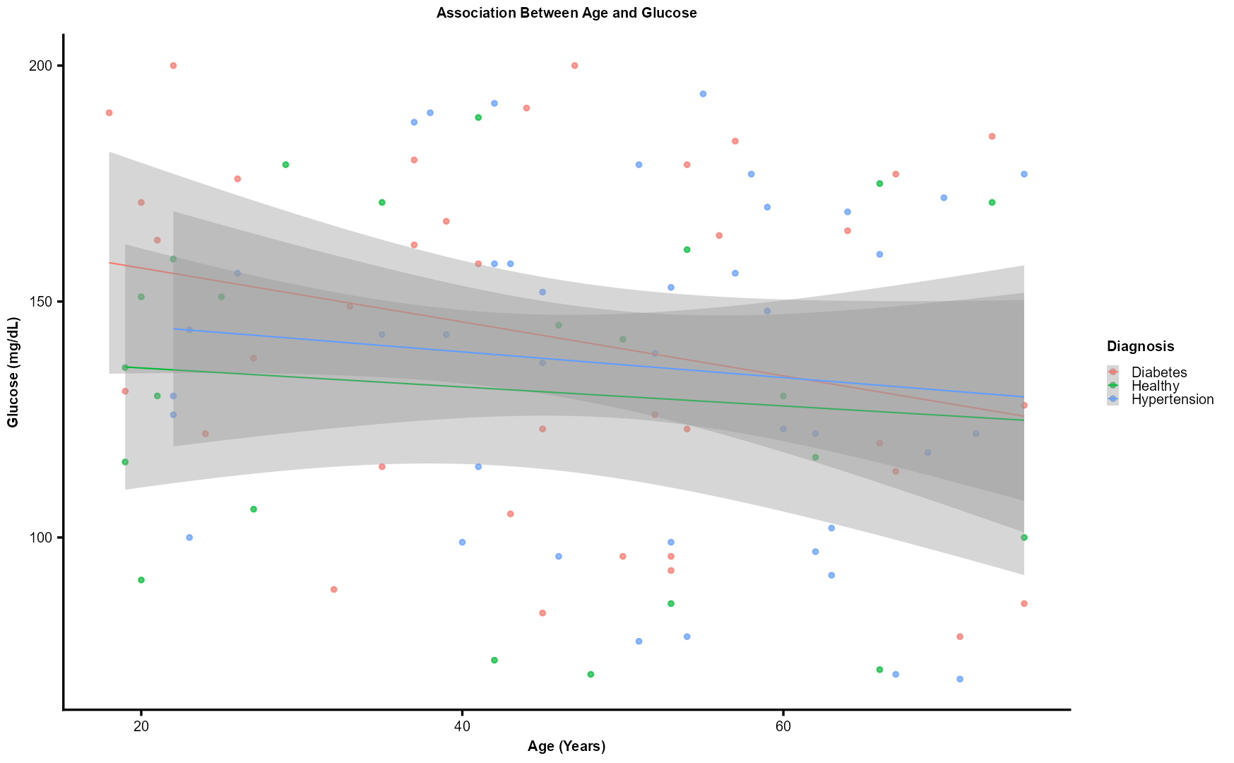
💡 Use case: Explore whether glucose tends to rise with age and how it differs by diagnosis.
ggplot(
  df,
  aes(
    x = Age,
    y = Glucose,
    color = Diagnosis
  )
) +
  geom_point(
    size = 2.5,
    alpha = 0.7
  ) +
  geom_smooth(
    method = "lm",
    se = TRUE,
    linewidth = 1
  ) +
  labs(
    title = "Association Between Age and Glucose",
    x = "Age (Years)",
    y = "Glucose (mg/dL)",
    color = "Diagnosis"
  ) +
  theme_pub
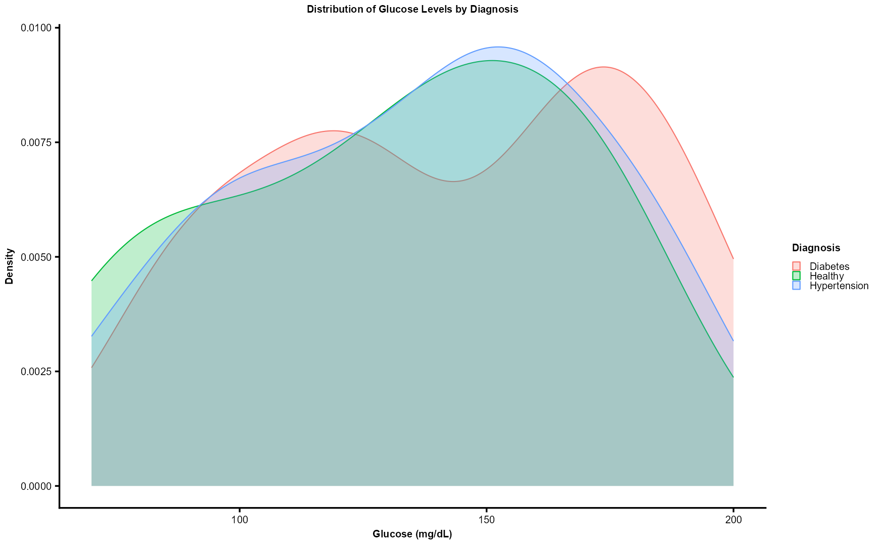
💡 Use case: Compare glucose distributions across diagnoses using kernel density estimation.
ggplot(
  df,
  aes(
    x = Glucose,
    fill = Diagnosis,
    color = Diagnosis
  )
) +
  geom_density(
    alpha = 0.25,
    linewidth = 1
  ) +
  labs(
    title = "Distribution of Glucose Levels by Diagnosis",
    x = "Glucose (mg/dL)",
    y = "Density"
  ) +
  theme_pub
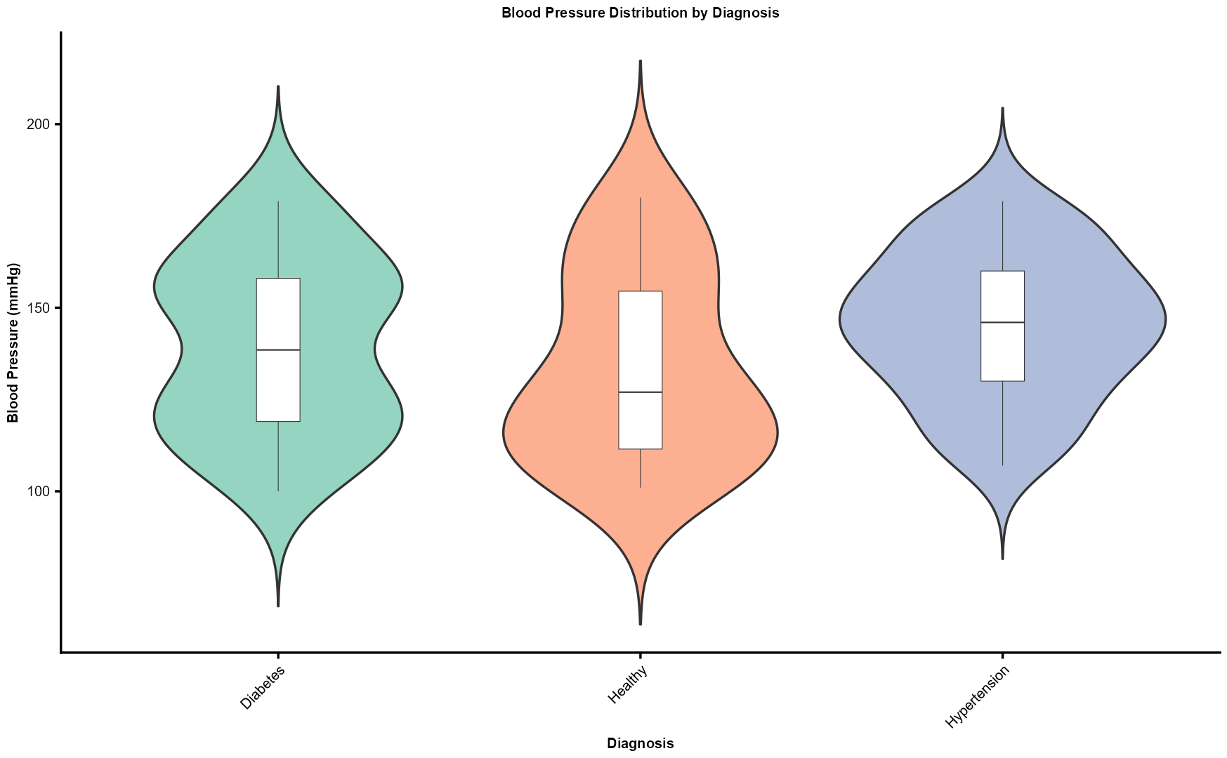
💡 Use case: Examine BMI variation among diagnostic categories.
ggplot(
  df,
  aes(
    x = Diagnosis,
    y = Blood_Pressure,
    fill = Diagnosis
  )
) +
  geom_violin(
    trim = FALSE,
    alpha = 0.7
  ) +
  geom_boxplot(
    width = 0.12,
    fill = "white",
    linewidth = 0.5
  ) +
  labs(
    title = "Blood Pressure Distribution by Diagnosis",
    x = "Diagnosis",
    y = "Blood Pressure (mmHg)"
  ) +
  scale_fill_brewer(
    palette = "Set2",
    guide = "none"
  ) +
  theme_pub +
  theme(
    axis.text.x = element_text(
      angle = 45,
      hjust = 1
    )
  )
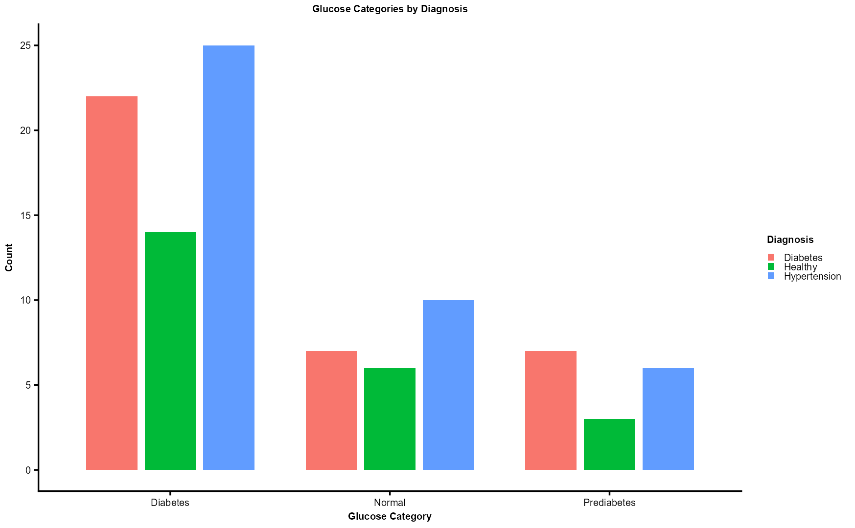
💡 Use case: Display patient counts per glucose category within each diagnosis.
ggplot(
  df,
  aes(
    x = Glucose_Category,
    fill = Diagnosis
  )
) +
  geom_bar(
    position = position_dodge(width = 0.8),
    width = 0.7
  ) +
  labs(
    title = "Glucose Categories by Diagnosis",
    x = "Glucose Category",
    y = "Count",
    fill = "Diagnosis"
  ) +
  theme_pub +
  theme(
    axis.text.x = element_text(
      angle = 0,
      hjust = 0.5
    )
  )
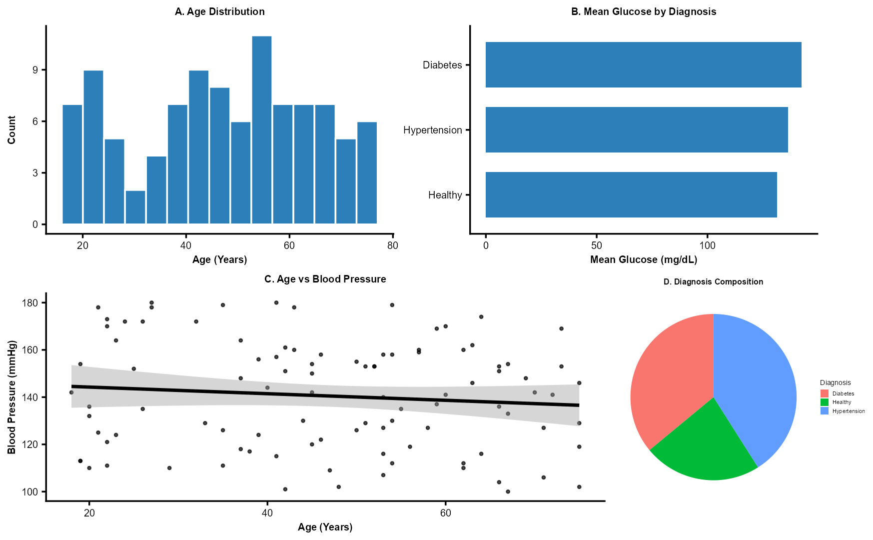
💡 Use case: Summarize proportions of diagnoses and visualize clinical indicators together.
library(patchwork)

p1 <- ggplot(df, aes(x = Age)) +
  geom_histogram(
    bins = 15,
    fill = "#2C7FB8",
    color = "white"
  ) +
  labs(
    title = "A. Age Distribution",
    x = "Age (Years)",
    y = "Count"
  ) +
  theme_pub

avg_glucose <- df |>
  group_by(Diagnosis) |>
  summarise(
    Mean_Glucose = mean(
      Glucose,
      na.rm = TRUE
    ),
    .groups = "drop"
  ) |>
  arrange(desc(Mean_Glucose))

p2 <- ggplot(
  avg_glucose,
  aes(
    x = reorder(Diagnosis, Mean_Glucose),
    y = Mean_Glucose
  )
) +
  geom_col(
    fill = "#2C7FB8",
    width = 0.7
  ) +
  coord_flip() +
  labs(
    title = "B. Mean Glucose by Diagnosis",
    x = NULL,
    y = "Mean Glucose (mg/dL)"
  ) +
  theme_pub

p3 <- ggplot(
  df,
  aes(
    x = Age,
    y = Blood_Pressure
  )
) +
  geom_point(
    alpha = 0.7,
    size = 2
  ) +
  geom_smooth(
    method = "lm",
    color = "black",
    se = TRUE
  ) +
  labs(
    title = "C. Age vs Blood Pressure",
    x = "Age (Years)",
    y = "Blood Pressure (mmHg)"
  ) +
  theme_pub

p4 <- ggplot(
  df,
  aes(
    x = "",
    fill = Diagnosis
  )
) +
  geom_bar(
    width = 1
  ) +
  coord_polar("y") +
  labs(
    title = "D. Diagnosis Composition"
  ) +
  theme_void(base_size = 14) +
  theme(
    plot.title = element_text(
      face = "bold",
      size = 16,
      hjust = 0.5
    )
  )

(p1 + p2) /
(p3 + p4)
Key Takeaways
ggplot2uses a layered grammar of graphics — start with data, add aesthetics, then layers.- Plots like density, violin, and scatter with regression add statistical depth.
- Visualizations are crucial for pattern recognition, data quality assessment, and research presentation.
- Use them to compare distributions, examine relationships, and summarize populations in any data.